
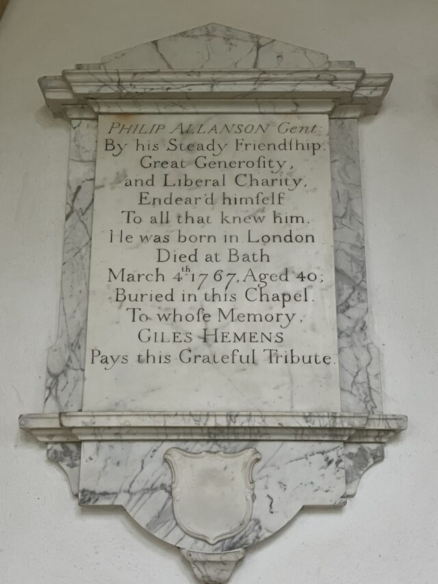
My main interest in tombstones is for what they say about the dead: this has shaped the way I have designed this website. But in the course of my research, I have found myself more and more drawn to inscriptions as specimens of the stone-carver’s art. Here is a particularly lovely example, from the plaque of Philip Allanson, “gentleman”, who died in Bath in 1767. The man who carved it has made free use of italics and capitals, and also of the long ‘s’ (ſ) – though only in the middle, not at the ends of words. All these are typical features of eighteenth-century lettering. Notice also the spacing between letters and words. It is wide, and varies subtly for the sake of balance and emphasis. (Thus for example the middle line, “to all that knew him”, is more widely spaced than the line above. Presumably this is to make it longer, and to give it extra force, since it ends the first sentence.) In general, as my stone carver friend Emma Lavender has pointed out to me, eighteenth-century carved lettering follows the rhythms of handwritten, not printed text; this is what gives it its flowing, unconstrained quality.
Around 1815, the style changes markedly. Inscriptions from this date onward are modeled on print, not handwriting. The letters are evenly formed and spaced. Often capitals are used throughout. The overall effect is more mechanical, and less engaging. The tombstones of Anna Stanhope (1819) and William Arney (1824) are typical.